Most of the time, it’s not even that pretty.
Tech falls apart right when you need them urgently. Based on my experience, they seem to fall in two major ways.
Flakiness
The quality of software descends free fall after a point in time, which is hard for me to define, but I can feel that it’s there. Maybe since the internet came to life, you now ship your software over the air instead of burning a CD, putting them in boxes and selling them in stores. The ship-now-and-fix-later mentally is also killing the quality of video games. Or maybe it’s agile software development, which ruins productivity and quality single-handedly. I don’t want to go into too many details about that. Nowadays, talking about agile is a lot like talking about politics. It’s meaningless, and it never ends with a meaningful conclusion.
“Simple”, but actually Complex Design

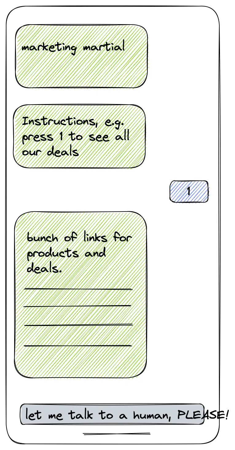
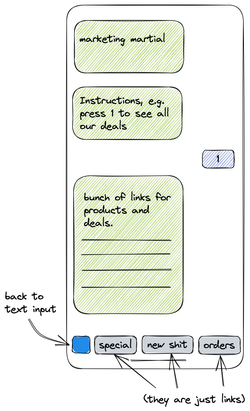
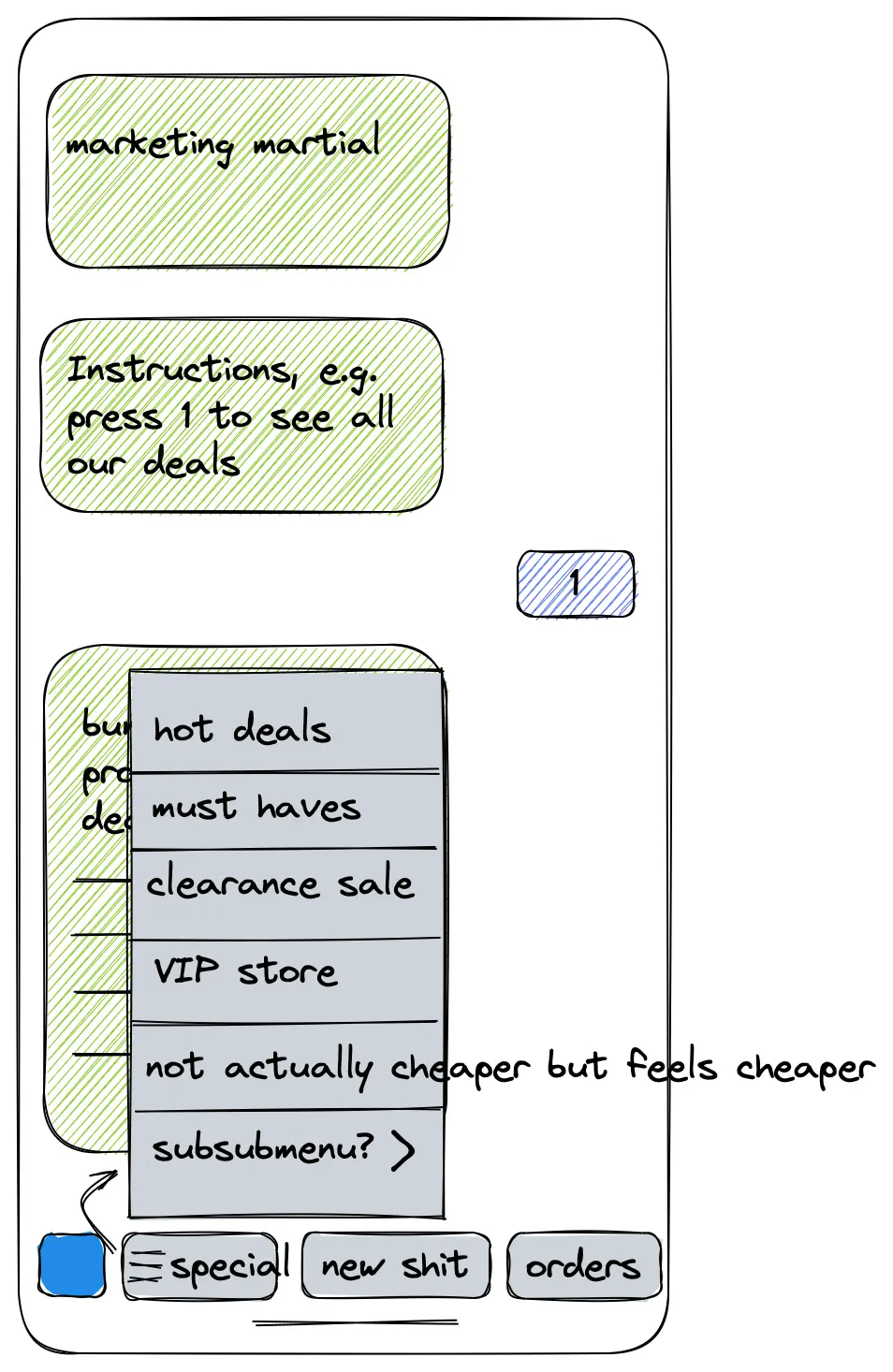
Take a look at the control panels in an aeroplane cockpit. Why do they overwhelm themselves with millions of knobs and meters? One would think out of all the professions, the pilot is the last one you’d want to distract or overwhelm with more stress during work. The “complicated” design does exactly the opposite. What is the most straightforward way to do X? Make a button. It costs your brain power to think about the “logical workflows” in modern software. For example, Apple has this infamous minimalist design philosophy. They hide away the complexity to achieve “aesthetic perfection”.
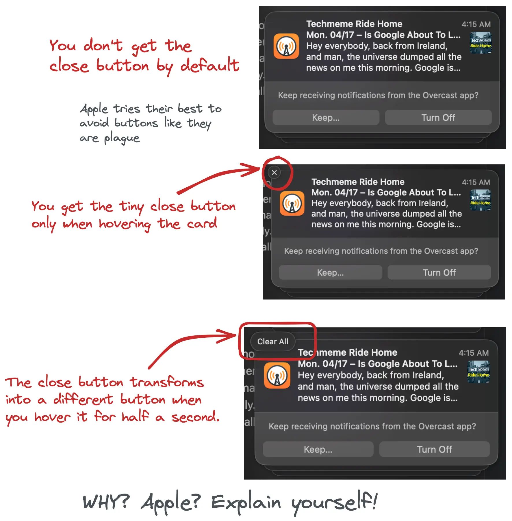 Imagine in the cockpit, the button to turn off a warning. Right before you pressed it, it changed into the “ignore all warnings button”.
It works well for the majority of use cases. Here is a common excuse: “The users only use 20% of the features 80% of the time, so why clutter the UI?” right? Of course, you can argue that if your design is smart enough (meaning, you can predict how people think, and define what is “common sense”, which is extremely hard), you can create something joyful to use. But those are few and far between, even for Apple’s own software. Not to mention the fanatic followings of the industry. The result is all software is pretty but suck to use. Most of the time, it’s not even that pretty.
Here’s an interesting thing about our human brains: if the tool fails me once, it negates all the 99 times when it worked. We like predictability. I need to know when I put something in the oven for x amount of time. It will turn out exactly how I want it. Not maybe.